No question. FIFA’s new “hydration breaks” suck.
Like fans everywhere, we hate how they change the game and mess up the momentum.
But as much as we loathe the breaks, you’ve got to admit. Some of the ads are pretty good. Respect (where it’s due).
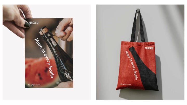
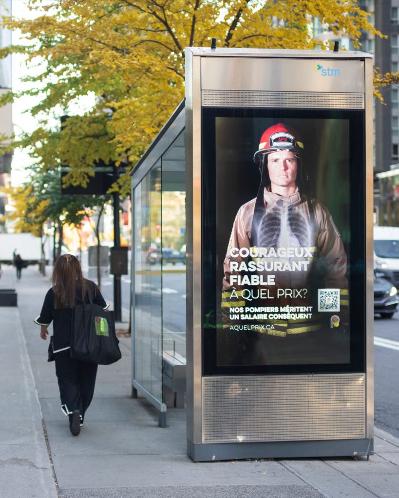
In non-profit and labour spaces, we’re usually not working with the unlimited budgets these spots have on their side, but it doesn’t mean we can’t learn the lessons to help you with your next campaign (and we’d love to)!
Here’s a quick wrap of some of our favourite ads from this World Cup. Just try looking away.
Lesson 1: Tell a story. And tell it well.
Ignore the big-name celebrities in this spot from Adidas. (We’re still fuming about Timothée’s unsolicited thoughts on the opera and ballet).
What makes this spot work isn’t really the talent. It’s good storytelling, pure and simple.
It hooks our attention, grabs our curiosity, and—crucially—tells us why we’re watching. We want to know what’s happening and how this (probably) true story is going to go.
There’s rumour, legend, intrigue, flashbacks, humour, and every hairstyle David Beckham has ever sported. No wonder it’s called “The Greatest Football Story Ever Told.” And we’re here for it till the very end.
Lesson 2: A great hook is both recognizable and unexpected.
“England x Palace”? No no no.
This ad could be called “Shakespeare x Football.”
The visual hook is what we love. The opening shots show a neck ruff – that pleated fabric collar from the 16th century that instantly reads Elizabethan – being worn by the guy we least expect: England legend Wayne Rooney.
It’s both incredibly well-known and completely surprising in this context. And that’s the reason we’re watching past the first few seconds.
Lesson 3: Make your audience part of the team.
This Brazilian ad is a reminder that a great ad needs to bring your audience on side—and make them part of your team.
Lesson 4: Lean in to what people already know.
“Les Bleus en Amérique” is a fun ad (and never underestimate the value of that).
This spot is a fast-moving play on some of the most well-known genres of American cinema. After all, Hollywood has been exporting American culture for a century. Why ignore that when you can mine it?
This ad shows that one of the best ways to build an instant connection with your audience is to lean in to what they already know and think.
In other words, meet people where they’re at. After that, you can go anywhere—together.
Lesson 5: Never take art, music, copy, type, and design for granted. They’re the essential ingredients of great advertising.
What is football? It’s “where strangers become brothers and sisters for 90 minutes,” according to the squad launch video from the Scotland National Team.
Now that’s beautiful copy—for the beautiful game.
Meanwhile, the Fédération Française de Football went for beautiful art direction. And it pays off with a spot that’s visually too interesting to stop watching.
Want to talk about a great ad for your next campaign? Our team is always ready to help.