


New Visual Identity
MGEU
With MGEU, the union representing 32,000 working Manitobans, our team designed a new visual identity that nods to the union’s proud past while emphasising its forward momentum and ambition.
For over 30 years, MGEU’s brand has been well-served by a simple red box with white lettering. But by 2025, it was time for the union’s look to evolve to better reflect its growing membership and influence.
We guided MGEU through our proven brand refresh process, listening to the team and designing a fresh look and feel that speaks to the union’s unwavering goals and values.
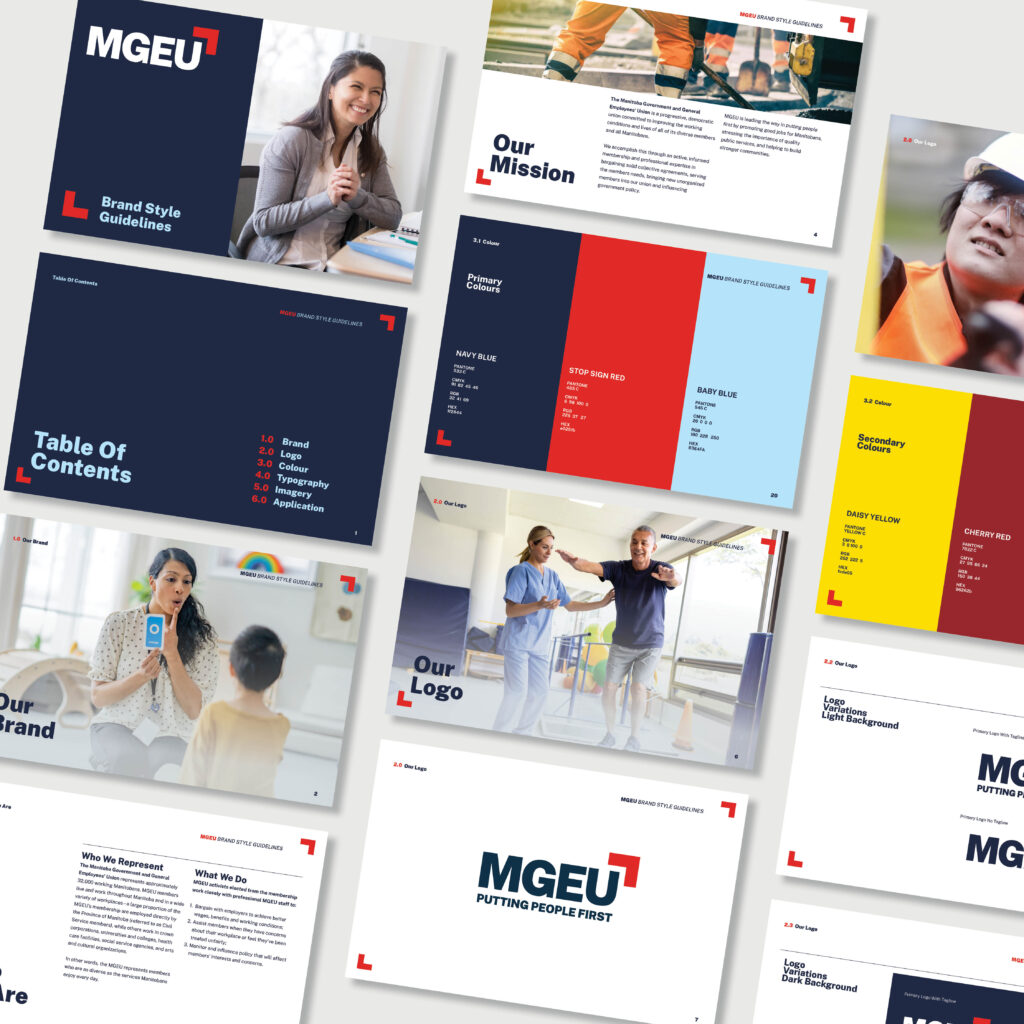
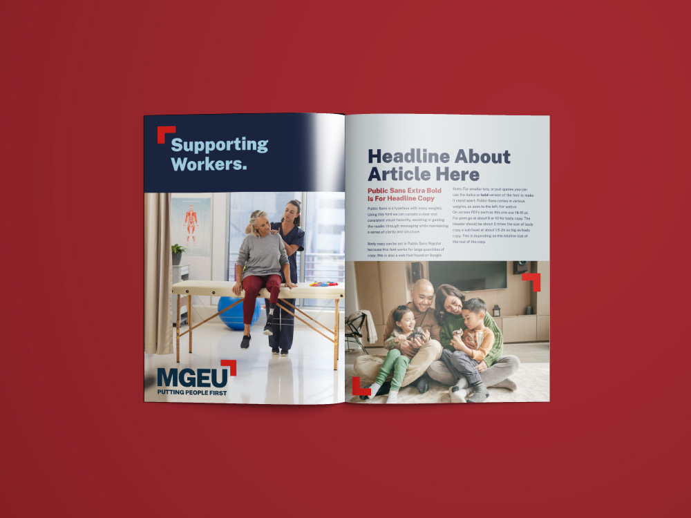
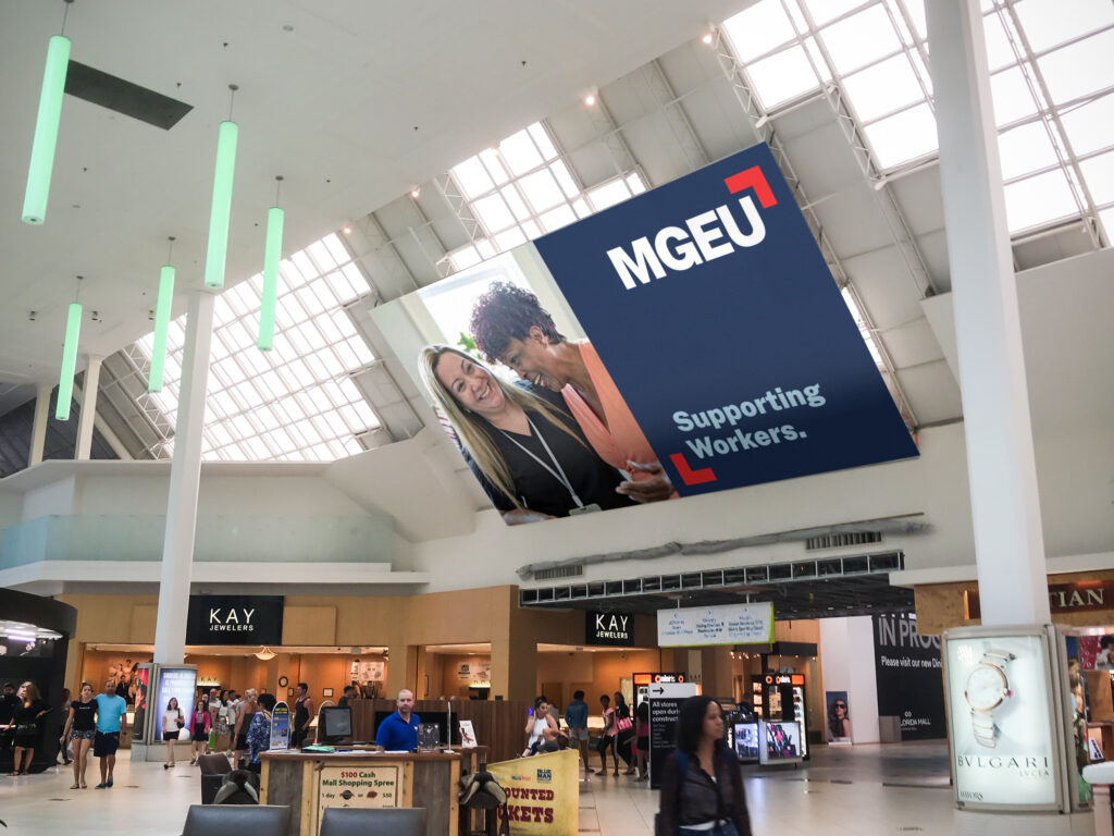
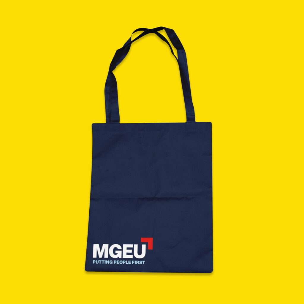
The new logo takes MGEU ‘out of the box’ with a modern look designed to prioritize accessibility and digital use. Our design team re-imagined the iconic square as a red corner and arrow, moving the brand forward and upwards – and reflecting MGEU’s commitment to lifting up its members and all Manitobans.
While the union’s look has been reimagined and refreshed, the union’s time-honoured tagline – Putting People First – remains at the heart of the brand. It’s the frame that perfectly defines MGEU’s commitment to the people and public services that make our communities strong and vibrant.

let’s do some good together

Vancouver / Edmonton / Winnipeg / Toronto / Ottawa / Montréal
1.877.682.5441
team@nowgroup.com